Building Chewie Mode with Claude
When I set out to build a new site for myself, I knew I wanted to use Ghost. It's a solid platform that allows for a good amount of customization via themes. Most Ghost themes assume a chronological feed which works well for writing, but it would make it a little harder for me to highlight projects. One goal for my site is to showcase the work I'm doing, not just the posts that tell their stories. I wanted my site to be personal as well, it had to have some hip-hop influence.
As the name suggests, the Solo theme was already close for a site that feels personal. It has minimal navigation and a structure designed for solo publishing, so I chose that theme as the starting point.
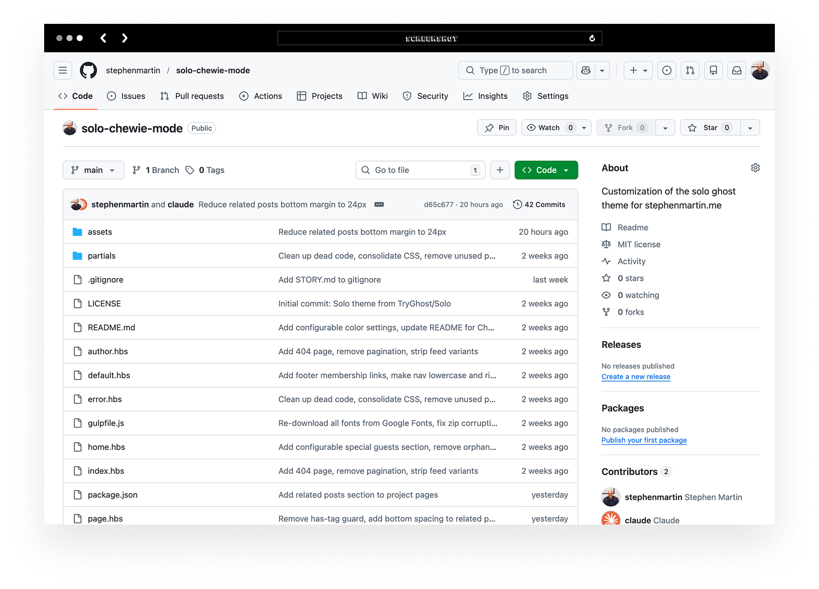
From there I began modifying the theme with Claude Code. Instead of editing templates file by file, I could describe the change I wanted and review the diff before committing it. My repo is public so anyone interested can see how the theme evolved and how Claude Code helped modify the original Solo templates.
Where "Chewie Mode" Came From
The visual language came from early hip hop concert posters, especially the ones collected in the book Born in the Bronx. Those old hip-hop posters relied on oversized type, starbursts, simple horizontal rules, hand-drawn illustrations and bold layouts printed on colored paper.
The name came from the base theme. As a Star Wars fan, Solo immediately made me think of Han Solo. The headlines in this theme stretch across the page and carry some of that same Chewbacca shouting "Raarghh!" energy, so Chewie Mode felt appropriate. It is also a small nod to the hidden Chewbacca mode on Smugglers Run at Disneyland.
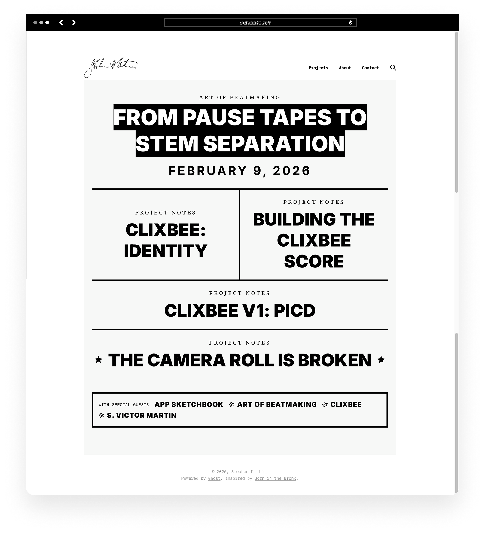
My goal was to make the site read more like a show poster than a blog. The latest post is the headline, followed by a few other recent posts, and my projects are the "special guests."
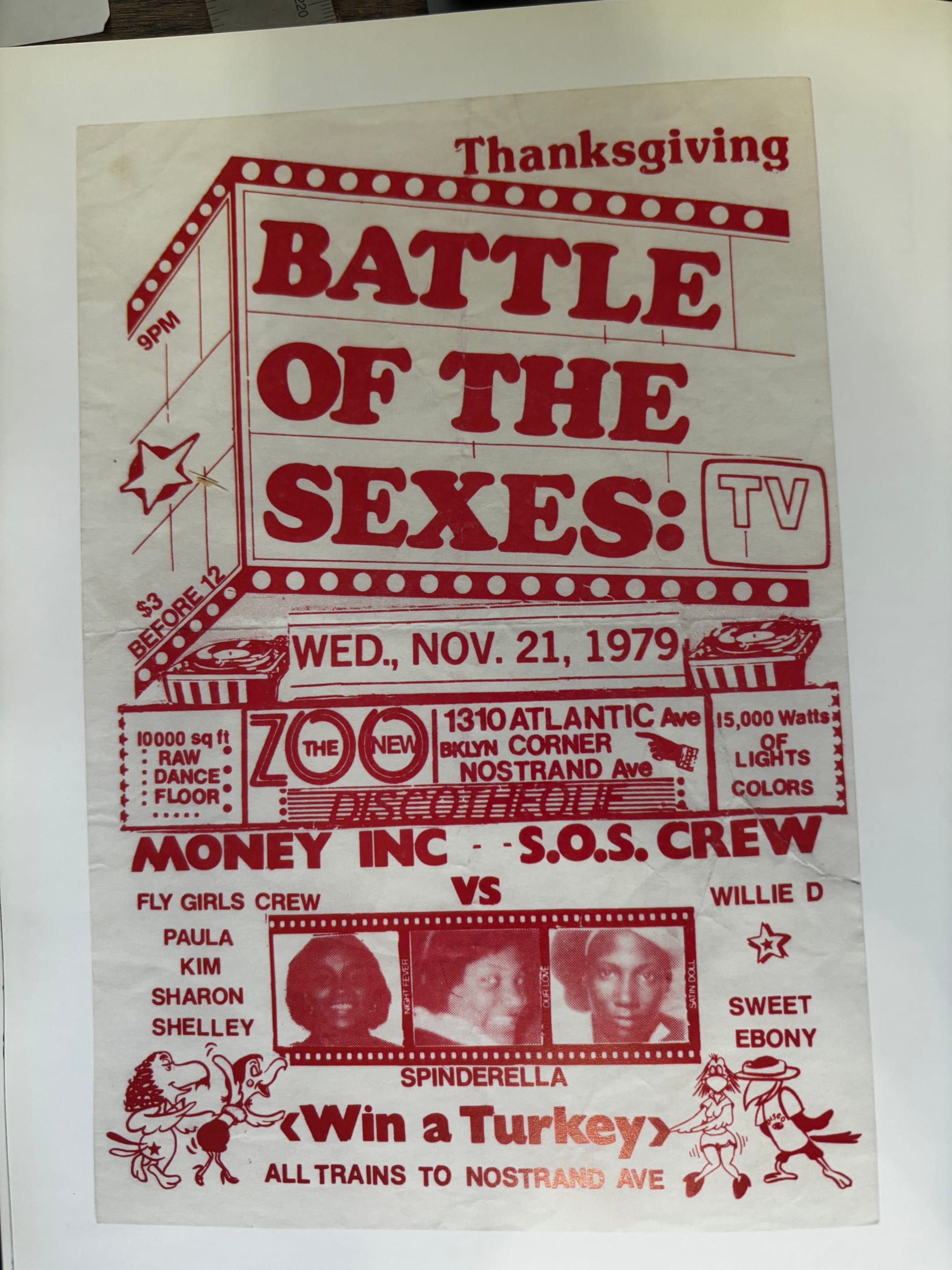
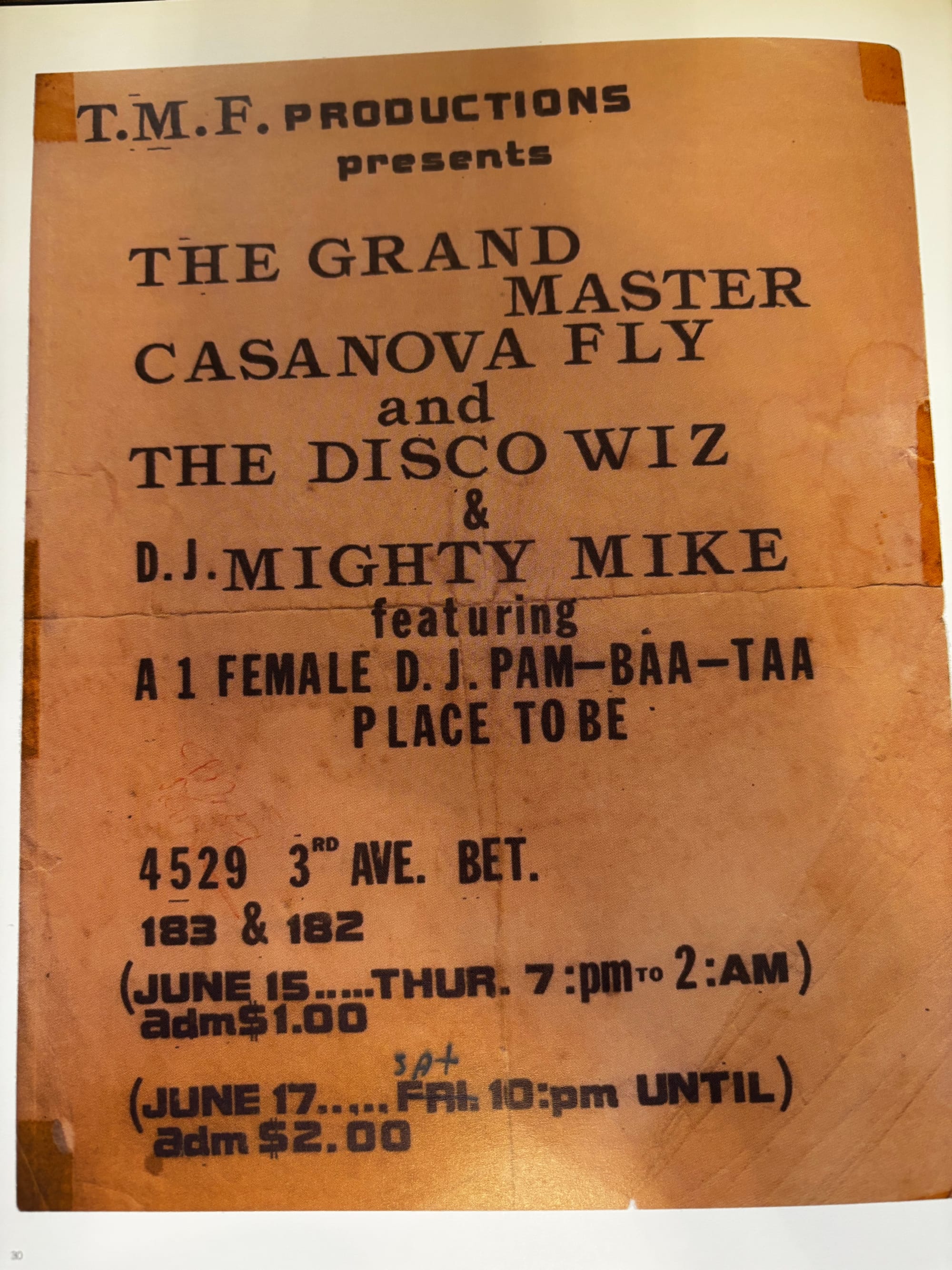
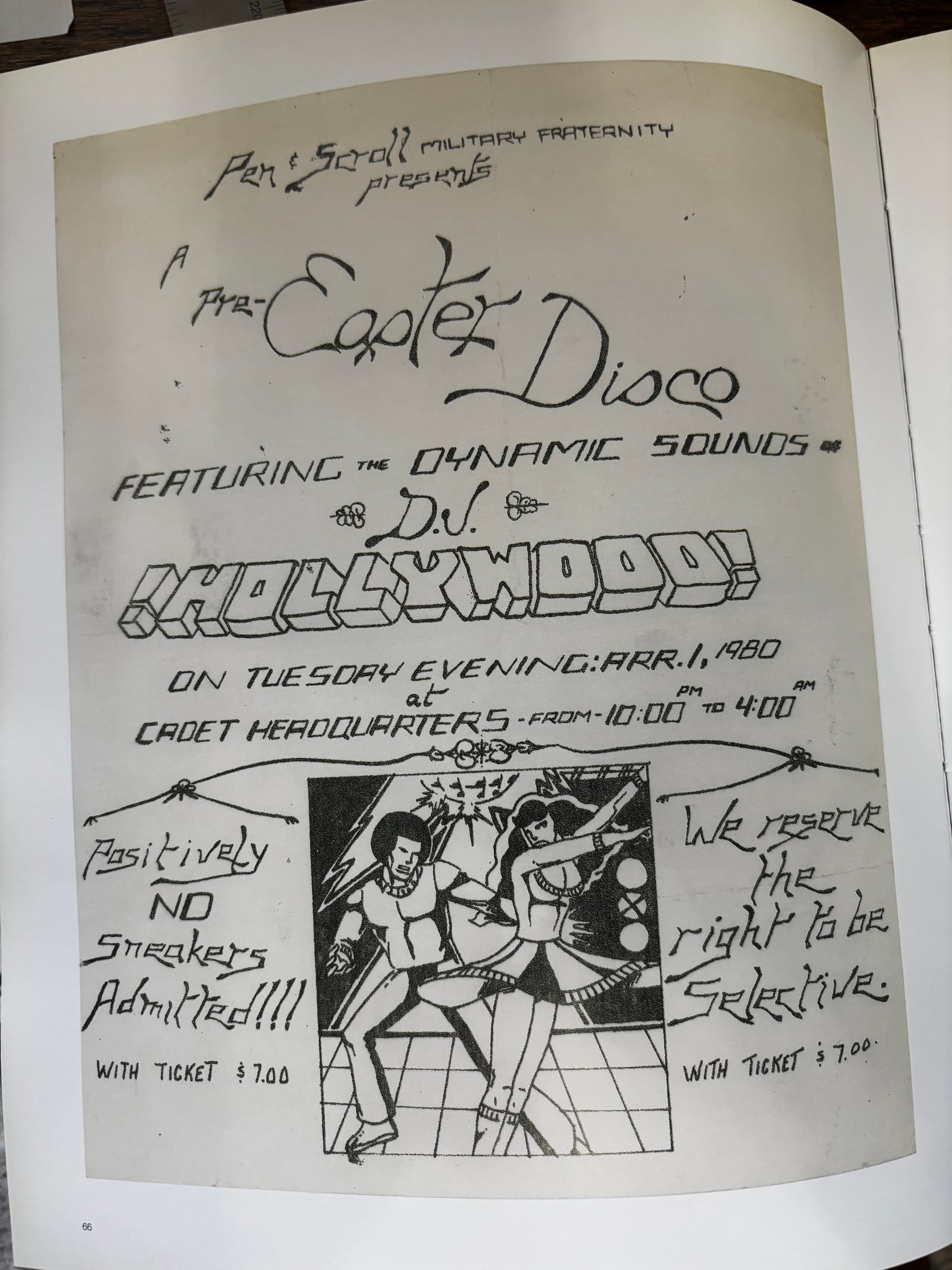
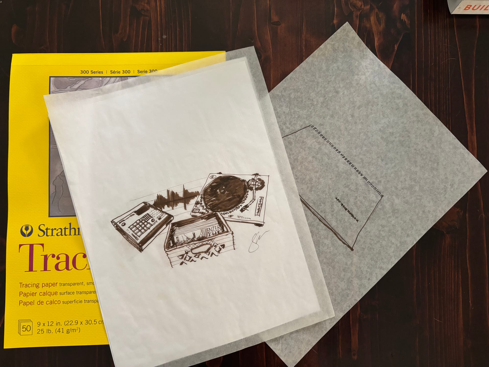
Early hip-hop show posters featured in Born in the Bronx.
Reworking the Homepage
The biggest change was the homepage which attempts to mirror the rhythm of the posters that inspired the theme as well. One headline entry appears at the top, followed by two supporting entries side by side. Additional posts appear below, and a final entry closes the page. This layout makes it easier to highlight current projects while still showing recent writing. I can toggle some pre and post headline stars by tagging the post as featured in Ghost.
Tag pages follow the same general idea. Each tag appears on top of a stretched starburst background and the list of posts reads like a show bill.
Building the Visual System
I ran a quick brainstorming session with ChatGPT and landed on Inter Black carrying the oversized headlines. Source Serif 4 for body text and IBM Plex Mono appears in navigation and metadata. These are modern typefaces that hold similar visual weight as those used in early hip-hop posters.
For the hand-drawn elements, I digital redrew a few from the original posters themselves. I refined the stars and arrows in Figma, and exported as SVGs. For lead illustrations, I've been drawing them by hand or using transparency paper to sketch over real photographs, then scanning them into Figma for cleanup.
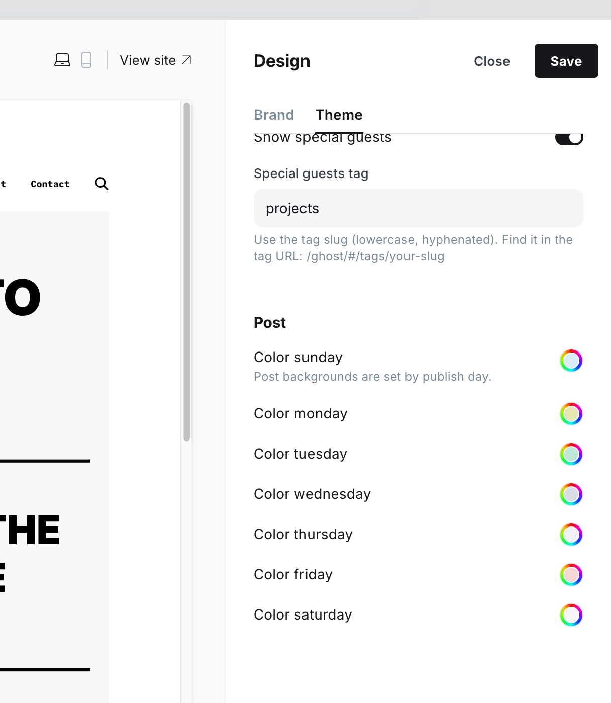
Leaning into the hip-hop poster theme, I've been hand drawing lead images and built a theme setting to control the page background color based on the day it was published for variety.
Post backgrounds rotate automatically based on the day the post is published. The colors can be selected in the Ghost theme settings, which makes it easy to adjust the palette without editing the theme.
Simplifying Solo
A large part of the work involved removing pieces of the original theme. Solo includes several layout options that Chewie Mode doesn't need. I removed the feed variants, the alternate About page layouts, and the built-in subscribe form. I had Claude pull the pagination as well, since I'm locking the homepage to a set of recent posts with tag pages and deep-linking to find older posts.
The projects section lives at the bottom of the homepage and pages tagged “Project” appear inside a bordered box labeled “special guests,” which gives projects a dedicated space within the poster layout.
Some areas of Ghost were intentionally left unchanged. Signup flows, payment pages, and account screens still use the default Ghost templates. The focus was on the public pages where the visual system matters most. I'm not sure if I'll spin up a subscription offering just yet. If I do, they'll be easy to revisit later.
One Small Detour
I did bump up against one small issue with fonts. Originally the theme used self hosted WOFF2 files. When the theme was uploaded to Ghost Pro, the fonts occasionally became corrupted during compression.
The easiest fix was to switch to Google Fonts and remove the self hosted files. Content delivery networks such as Cloudflare sometimes compress or transform assets in ways that can interfere with font delivery, so loading the fonts directly from Google avoided the issue. From what I was able to find, this is a known issue. A little bit of a speed tradeoff but I'm not dealing with heavy traffic here.
Finishing Details
I spent the final day of my roughly four day Claude Code pairing session on small interaction details.
- Buttons use a simple treatment: white background, black border, and uppercase mono text. Hover states invert the colors.
- Homepage headlines highlight on hover by switching to a black background with white text. The effect wraps cleanly across multiple lines and keeps the hip-hop poster feel.
- Navigation text remains lowercase across breakpoints, and sign in links move to the footer on smaller screens if I ever decide to turn it on.
One last layout bug appeared on pages with very little content but was easy to fix. The main content container was not stretching across the page because of a flexbox interaction. Adding a single width: 100% declaration resolved the issue. Thanks, Claude!
What I’ll Be Iterating On Next
The theme is functional, but a few pieces still need attention since I'm not actively using them in any of my recent posts. Ghost cards such as Bookmark, Button, Callout, Toggle, and File still use some default styling. I eventually want those components to match the poster aesthetic used throughout the rest of the theme so I'll hit those as I use them in my posts (it's really easy to upload an updated theme).
I'm also considering the idea of a topic-based set of newsletters so readers can subscribe to specific projects or a writing series instead of a single "everything" email. My interests are diverse but I want readers to have the option to plug into specific topics.
Most importantly, I want to keep posting! The site is designed to highlight my work, whether that's a new project, a piece of writing, or hip-hop instrumentals I publish as S. Victor Martin.
If this post resonates or you want help with your own Ghost theme, just reach out!
