Clixbee: Identity
Clixbee had started as a way to pick the single best photo from a recent batch. Once I added the ability to choose the best photo from a specific selection of photos, the name began to feel too narrow.
I went back to basics and started brainstorming names. I used ChatGPT to generate variations built around click, select, and pick. One of the candidates that stood out was Clixby. It felt unique and modern enough to bat it around. I ran it by my daughter and she said, “Oh, I thought you meant Clix-bee, like a bee.” Kids are pretty genius.
Connecting the App to Bees?
Bees are efficient foragers. They evaluate color, light, and subtle signals to find the richest flowers so the metaphor was direct without being forced. The app evaluates images which is not too dissimilar from how a bee evaluates flowers.
We did a quick pass to make sure the name was not already in use and then I hired a freelancer to explore early logo concepts. The first drafts leaned more literal. Full bee illustrations. They were strong starting points but the wrong kind of expression for the product.

I used the commissioned illustration as a starting point for some drafts. I combined the logotype and integrated some callouts to bees and flowers. Then I pulled the color and shadows out of the bee illustration and brought it closer to my hand drawn sketch. I wanted an identity that could exist without leaning on a full color mascot. I have often leaned on my own handwriting for personal projects in the past as well. It's slightly awkward and organic, which seemed to fit with a more "in the background" brand.
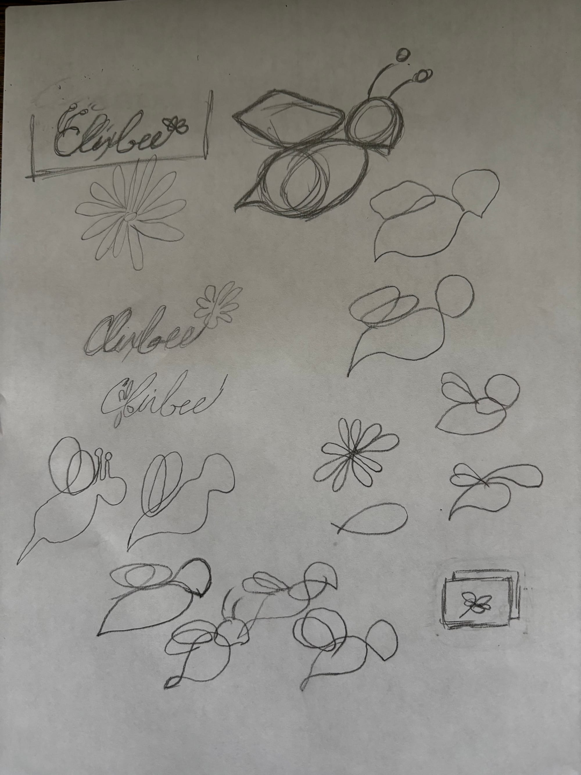

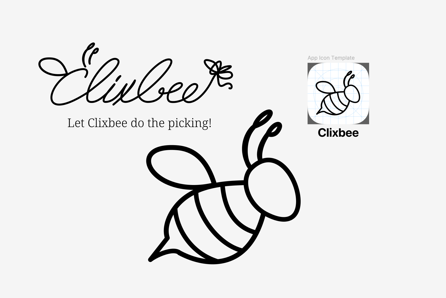
Sketches, close up of final sketch, and the final draft in Figma.
The tagline quickly wrote itself: “Let Clixbee do the picking!” It described the behavior and was a nice callback to the original Picd name I had come up with during prototyping.
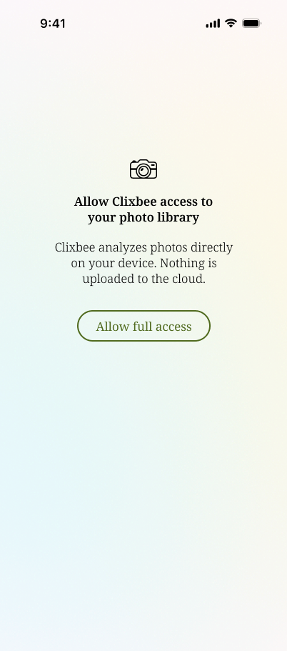
Color decisions followed the same rule. The app interface remains clean so the photos carry the visual weight. The only splash of color shows up in background gradients and UI highlights for more recognizable tap areas.

Highlighting Your Top 5
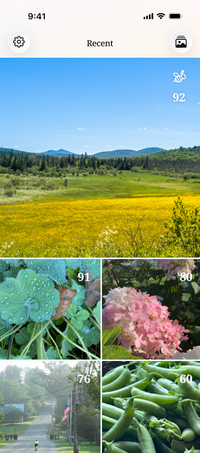
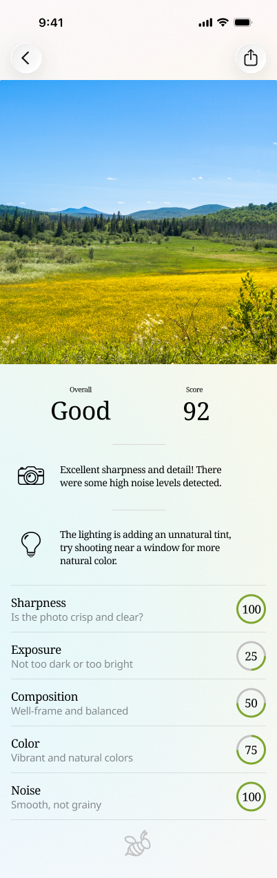
UI exploration was also happening in parallel. I tried everything from grids to bento layouts. All of them added structure but ultimately distracted from the images themselves. The design eventually shifted to emphasize the highest rated photo as a hero image, followed by the other selections which is helpful when you're comparing a photo with the exact same subject and composition.
Clixbee kept the scoring engine and detail screen from Picd but the identity evolved into something with legs or should I say, wings.
Now that I have something that feels like a real iOS app, it's on to the App Store...
